

Key Takeaways
Visual Balance in Interior Design
Visual balance is the sense that a room's furnishings, colors, and objects are arranged in a way that feels stable and intentional - not crowded on one side or uncomfortably empty on another. It's the underlying reason some rooms feel instantly comfortable while others feel restless even when they're tidy. Balance isn't about symmetry alone; it includes how visual weight (the sense of heaviness or lightness an object creates) is distributed across a space.
Designers distinguish three types of balance: symmetrical (mirrored arrangement), asymmetrical (different objects with equal visual weight), and radial (elements arranged around a central point). Most residential rooms benefit from a mix of all three.
The Problem Is Usually Invisible - Until You Know What to Look For
Most people redecorate by feel: they move furniture around, add a new throw pillow, repaint a wall - and still can't shake the sense that something is off. The frustrating truth is that the real problems in most rooms aren't visible as individual mistakes. They're patterns: structural relationships between furniture, light, color, and space that quietly undermine everything else.
Understanding a handful of core design principles doesn't require training. It requires knowing what questions to ask. Start by standing in the doorway of your room and observing it as if for the first time. Where does your eye go? How long does it stay there before it drifts? That moment of drift is the problem speaking. See the foundational concepts behind decorating any room for broader context on how these principles connect.
Scale Mismatch: The Mistake Hidden in Plain Sight
Scale - the size of objects relative to each other and to the room itself - is the most common invisible culprit. A large sectional sofa in a small room doesn't just take up space; it changes how the room is experienced, making ceilings feel lower and walls feel closer. The opposite is equally disruptive: petite chairs and a spindle-leg coffee table in a high-ceilinged loft feel like doll furniture and read as indecisive.
The fix isn't always buying new furniture. Sometimes it's editing - removing a piece to give the remaining furniture room to breathe. Before making any purchases, consider measuring and mapping your room carefully to understand what scales will actually work in your space.
The 18-Inch Furniture Float Rule
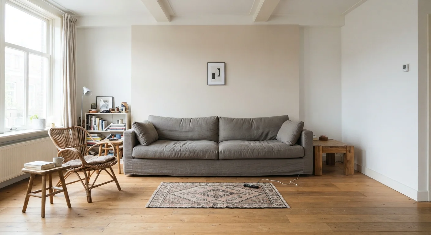
When repositioning furniture, try pulling your largest piece - usually the sofa - at least 18 inches from the nearest wall. This single change often resolves the 'waiting room' feeling in living spaces immediately. You don't need more floor space; you need the floor space you have to be visible and purposeful.
Area rugs deserve special mention here. A rug that's too small is the single most common scale error in living rooms. It makes a furniture grouping look unanchored and shrinks the perceived size of the room. For guidance on sizing, see rug placement principles that designers rely on.
Focal Points and the Wandering Eye
Every room that feels composed has a focal point - a place where the eye naturally lands and rests. It could be a fireplace, a large window with a view, a bold piece of art, or a well-styled shelving unit. The issue arises when a room has no focal point, or - equally disorienting - several competing ones that pull attention in different directions simultaneously.
If your room doesn't have an obvious architectural anchor, create one. A gallery wall centered above a sofa can serve this purpose well; the practical approach to planning and hanging a gallery wall walks through exactly how to do this without the work looking haphazard.
“A room should be composed like a painting - with a clear point of emphasis and supporting elements that lead the eye there, not compete with it.”
— Elsie de Wolfe, Pioneer of American interior decoration and author of 'The House in Good Taste'
Furniture Against the Walls - and Why It Backfires
The instinct to push all furniture against the walls is understandable: it seems like it should maximize floor space and make a room feel larger. In practice, it usually does the opposite. Furniture ringing the walls creates a hollow center and a sense of disconnection - like a waiting room rather than a living space.
Floating furniture - pulling pieces inward so that a sofa sits a foot or two from the wall, facing other seating - creates conversational groupings that make a room feel intentional and inhabited. It also, counterintuitively, makes the room feel more spacious, because the eye can perceive depth on all sides of each piece rather than seeing it flatten against a wall. This is one of those decorating decisions that reveal their problems slowly - it often takes weeks of living in a room before the wall-hugging layout starts to feel wrong.
Light: The Design Element Most Homeowners Overlook
Lighting is perhaps the most underestimated tool in a room's composition. Homes with only overhead ceiling fixtures - the default in most American construction - are lit flatly. Flat light removes shadows, and shadows are what give a room dimension and warmth. Without them, even a beautifully furnished room can feel like a showroom floor.
The solution is layering: combining overhead light with sources at mid-height (table lamps, sconces) and low level (floor lamps). This creates pools of light that add depth, define zones within a room, and allow the mood to be adjusted depending on the time of day or occasion. It costs far less than new furniture and has an outsized impact on how a room feels. For readers interested in challenging more assumptions about what works in a room, common decorating myths examined against how rooms actually work is worth reading alongside this article.