

Key Takeaways
The Foundations: How Design Principles Actually Work
Interior design can feel intimidating because it appears subjective - but most of what makes a room feel right or wrong comes down to a handful of learnable principles. These are balance, proportion, rhythm, emphasis, and harmony. Together they form a kind of invisible structure underneath every well-designed space.
Balance refers to the visual weight distributed around a room. Symmetrical balance (matching lamps on either side of a sofa) feels formal and calm. Asymmetrical balance (a tall plant offsetting a low, wide bookcase) feels modern and dynamic - but requires more confidence to pull off. Proportion is the size relationship between objects and the room itself. A loveseat in a great room will always look stranded; a sectional in a studio apartment will always feel oppressive. Rhythm means repeating a colour, shape, or texture at intervals so the eye has a path to follow. Without it, rooms feel chaotic. Emphasis is your focal point - the fireplace, the statement headboard, the picture window. Every room should have one. Harmony is the result when all the others work together.
Understanding these principles protects you from costly reversals. Our guide to decorating choices that create problems later shows exactly how ignoring proportion and flow leads to regrets down the line.
Colour Theory Made Practical
The colour wheel divides hues into primary (red, blue, yellow), secondary (orange, green, violet), and tertiary colours. For homeowners, three colour relationships are most useful:
- Complementary: Colours opposite each other on the wheel (blue and orange). High contrast, energetic - best used in accents rather than dominant walls.
- Analogous: Colours sitting next to each other (blue, blue-green, green). Naturally harmonious; ideal for calming spaces like bedrooms.
- Neutral base with one accent: The safest starting point for beginners. Choose a warm or cool neutral for large surfaces, then introduce one deliberate accent colour in textiles and accessories.
Undertones matter enormously. A paint chip labelled "white" may read pink, yellow, or green under your home's specific lighting conditions. Always test paint on the actual wall - a 12-inch square - before committing, and observe it at different times of day. The same applies to fabric swatches and tile samples.
Before purchasing any rug, lay out painter's tape on the floor in the rug's intended dimensions. Living with the taped outline for a day or two will confirm whether the scale is right before you commit.
Scale errors with rugs are among the most frequently cited beginner mistakes in interior design, and they are easy to avoid with this low-cost previewing step.
When in doubt about a paint colour, go one shade lighter than your instinct on large walls. Paint almost always reads darker once it covers the full surface and reflects less surrounding light.
The surrounding environment, floor, and ceiling affect how paint reads at scale - what looks mid-toned on a chip frequently reads much deeper once applied to four walls.
Darker colours visually lower ceilings and reduce perceived room size, while lighter tones do the opposite. A dark accent wall behind a bed can add drama in a large room but feel suffocating in a small one.
Furniture Scale, Layout, and Traffic Flow
Scale is the single area where beginner homeowners make the most consequential mistakes. Undersized rugs - where only the front legs of a sofa sit on the rug, or worse, none do - and undersized furniture are hallmarks of an unresolved room. A general rule: in a living room, all main seating legs should sit on the area rug, or the rug should be large enough to anchor the full seating group.
Layout planning should begin on paper (or a free digital floor-planner tool) before you move a single piece of furniture. Measure your room carefully: length, width, and ceiling height. Note window and door placements. Then map the conversation area - the cluster of seating that allows people to talk comfortably without raising their voices. Ideal distance between facing seats is roughly 8 to 10 feet.
Traffic flow means ensuring pathways through the room are at least 30 to 36 inches wide. Furniture placed against every wall does not create more space - it actually makes a room feel smaller and harder to move through. Floating furniture away from walls is a counterintuitive but effective way to make a room feel larger and more intentional.
Room-by-Room Priorities
Each room in a home has a primary function that should drive its design logic before aesthetics enter the picture.
Living Room
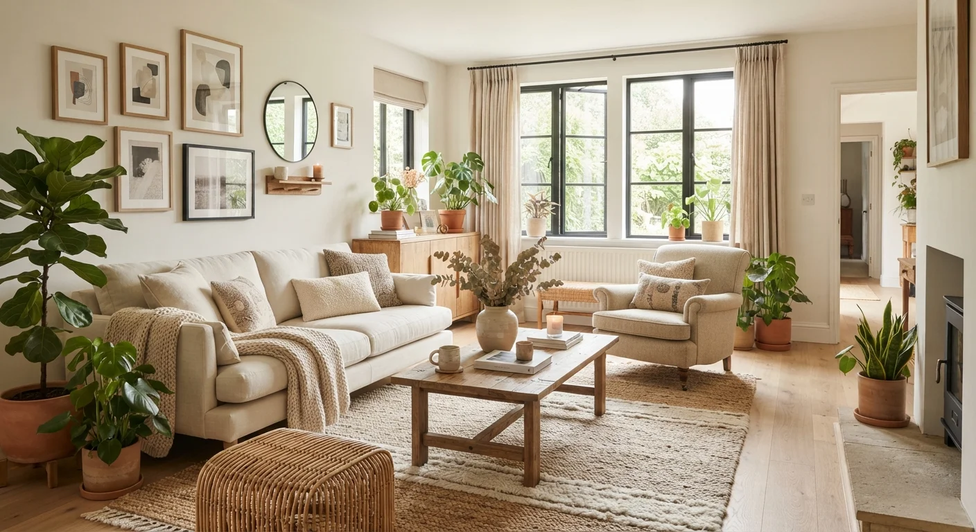
The primary functions are conversation and rest. Prioritise seating comfort, a clear focal point, and flexible lighting. Avoid over-furnishing.
Kitchen
Function is paramount. The classic work triangle - the path between the sink, stove, and refrigerator - should be unobstructed. Backsplash tile is one of the most impactful visual decisions in a kitchen; our tiling a backsplash guide walks through the full process.
Bedroom
Prioritise calm. Keep the colour palette on the cooler or more muted side of your preferences. The bed should be the clear focal point, positioned so you can approach it from at least one side, ideally two.
Bathroom
Small scale demands precision. Mirrors, lighting placement (beside rather than above the face), and consistent materials across surfaces carry disproportionate visual weight here.
Home Office
Ergonomics first, then aesthetics. The chair, desk height, and monitor position determine daily comfort. Decor that signals focus - a cohesive backdrop for video calls, controlled natural light - follows from there.
Lighting: The Layer Most Homeowners Skip
Most homes rely almost entirely on a single overhead ceiling fixture - what designers call ambient lighting. This creates flat, shadowless illumination that drains a room of warmth and depth. Effective lighting uses three layers:
- Ambient: Overall illumination - ceiling fixtures, recessed lights, chandeliers.
- Task: Directed light for specific activities - reading lamps, under-cabinet kitchen lighting, vanity lights.
- Accent: Highlighting architectural features or artwork - picture lights, wall sconces, uplighters.
Dimmer switches are one of the highest-value changes you can make room by room, allowing a single ambient source to serve multiple moods. Note that installing dimmers involves working with electrical wiring; if you are unfamiliar with electrical work, this is a task for a licensed electrician.
Colour temperature (measured in Kelvins) also matters: warm white (2700-3000K) suits living rooms and bedrooms; cool white (3500-4100K) suits kitchens and bathrooms; daylight (5000K+) suits task-heavy workspaces. Mixing colour temperatures in a single room tends to feel incoherent.
Pulling It All Together Without Overspending
Cohesion across a whole home does not mean every room matches - it means every room shares an underlying logic. Establish a home-wide palette anchor: two or three colours or materials that recur in different forms from room to room. A warm white trim, a consistent wood tone in floors or furniture, and a single recurring accent colour can unify spaces that are otherwise quite different in style.
Approach spending strategically. Allocate more budget to items you touch daily and that are expensive to replace - sofas, mattresses, primary flooring. Spend less on easily swapped elements like cushions, throws, and decorative objects, which are where personal style can shift without long-term commitment.
For homeowners who want to go deeper on structural improvements that affect design outcomes, the home improvement beginner's guide covers planning, permits, and hiring professionals in detail. The Home Improvement hub is also a useful ongoing reference as your projects evolve.
Finally, design is iterative. Commit to a considered starting point, live with it, and adjust. The rooms that feel most personal are rarely the ones designed all at once.